In this example, we'll use AnyMod's built in buildImage method to always size an image to match the width of a visitor's browser window. This means large screens will see a high-resolution image, while smaller screens will see a scaled-down version of the same image.
With this approach, we can have high-resolution when needed but also have fast page loads on mobile devices.
# 1. Add an image to your mod
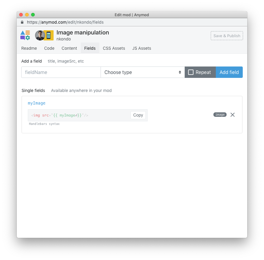
Click the pencil icon at the top of the page, then visit the Fields tab.
Add a field called myImage to your mod with type Image:
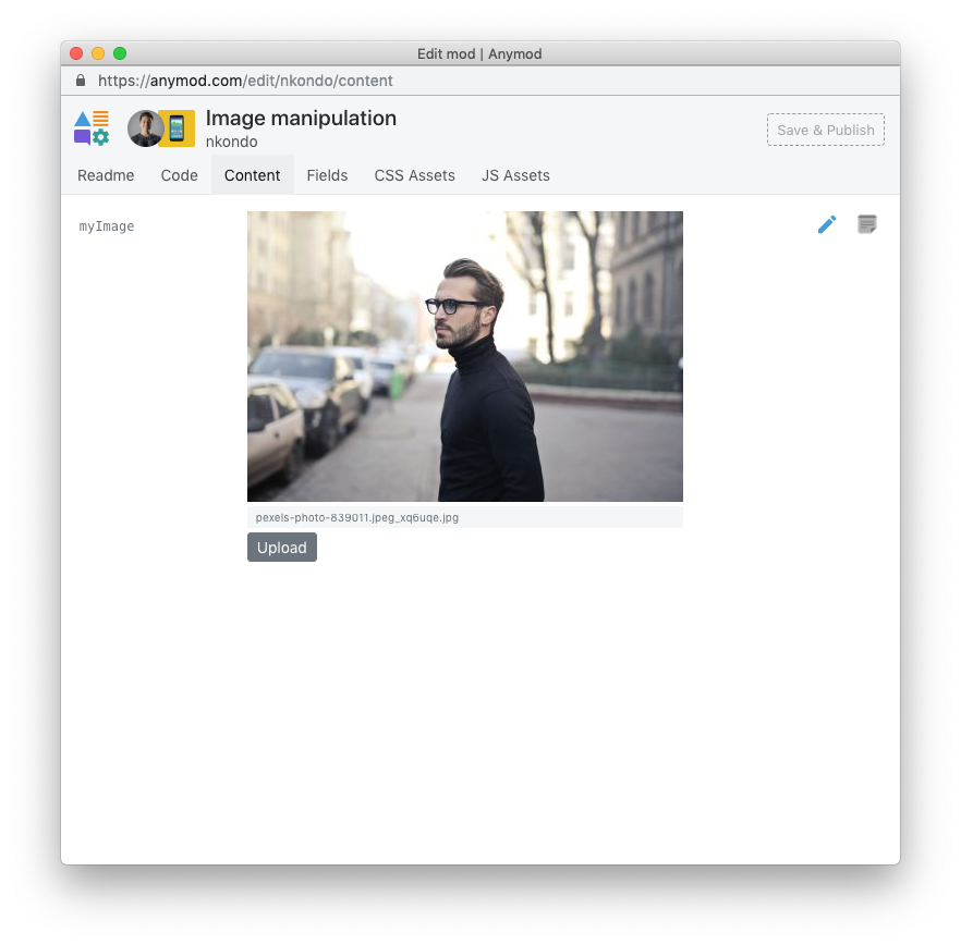
Now click on the myImage link and upload an image:
# 2. Scaling the image based on screen size
First, let's add a rule to the mod's CSS panel so that our image will never exceed the width of the screen:
img {
  max-width: 100%;
}
TIP
Any rules defined in the mod's CSS panel will apply only to the mod and not to other elements on a web page. In this case, the only img element affected will be the one in this mod.
Next, in the mod's JS panel, add the code below, which does the following:
- Line 1: Use the built in
AnyMod.buildImagemethod (docs) to manipulate the image, which is available asmod.data.myImage - Line 2: Set the width of the image to
window.innerWidth - (window.innerWidth % 100) + 100, which is always just a little bit wider than the current window size - Lines 6-8: Insert the image into the mod
var resizedImage = AnyMod.buildImage(mod.data.myImage, {
  w: window.innerWidth - (window.innerWidth % 100) + 100,
  c: 'limit'
})

var img = document.createElement('img')
img.setAttribute('src', resizedImage)
mod.el.appendChild(img)
# 3. Result
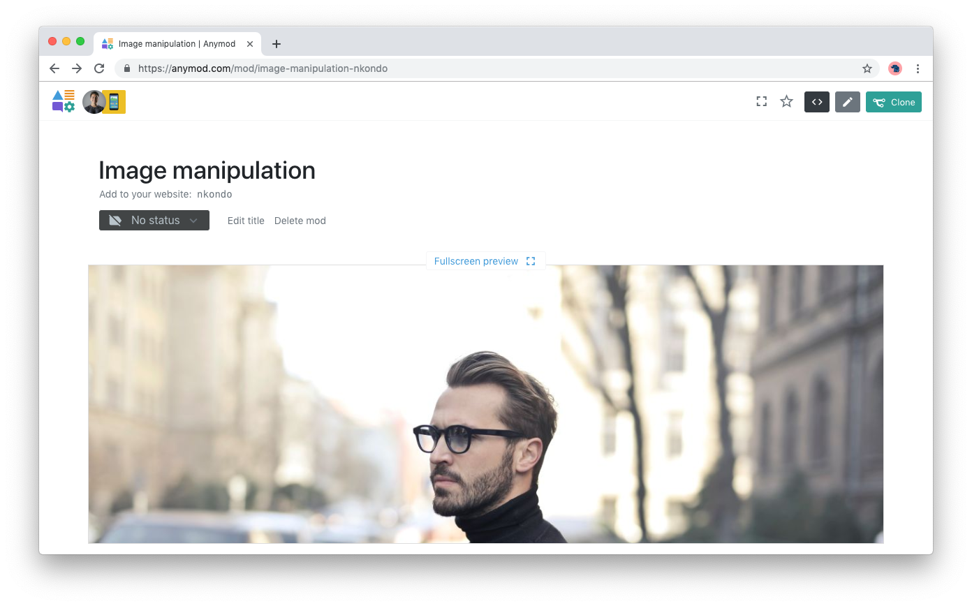
The final result is an image that is a different size based on the width of the browser window.
If the window is 1200px wide, the image will be 1300px wide. If the window is 420px wide, the image will be 500px wide, and so on.